

Whose world in data?
Whose world in data?
Our World in Data is one of the most useful websites. But some of its data should carry a clearer health warning. Ideology causes the the datamongers to substitute fact with fiction.

I am a big fan of Our World in Data (OWiD). I used to find primary sources of data from governments and agencies much easier to obtain. But in recent years, much data has been hidden behind paywalls, the series shortened, and the raw data presented in less helpful ways. I couldn’t help sensing that much data that was being released was being given either begrudgingly or had been so massaged as to be propaganda. Moreover, green interlocuters, who are invariably dyscalculic, are disinclined to believe anything that doesn’t have a green blob-approved logo stamped on it. OWiD compiled all the data from seemingly authoritative sources, and sealed it with the authority of the University of Oxford, from where the project is based.
It has made data-based debates so much easier. I obtained nearly all the data for our film Why There is no Climate Crisis from OWiD. Using OWiD, all the claims of XR/JSO-style activists can be debunked in just minutes. Alarmists claim that people are dying, starving, drowning, burning, and being made sick. But all the data shows the opposite cases: people are living longer, healthier, wealthier and safer lives than every before. And nobody can reply that I have used unreliable data from dodgy ‘denier’ sources.
But not all green activists are petty vandals who block streets and spray paint. OWiD itself has quite a green bent. Head of research at OWiD, Hannah Ritchie has caused quite a stir in recent months, becoming somewhat outspoken in her criticism of climate alarmism, and for her more optimistic reformulation of climate-environmentalism in a book, Not the End of the World: How We Can Be the First Generation to Build a Sustainable Planet. In an extract from the book published in the Guardian, Ritchie explains,
With reports of disasters coming at me faster every day, it seemed that things must be getting worse. Climate change was driving an intensification of disasters, and more people were dying than ever before.
Or so I thought. The problem was that I mistook the increase in the frequency of reporting as an increase in the frequency of disasters. I mistook an increase in the intensity of my secondhand suffering for an increase in the intensity of global suffering. In reality, I had no idea what was happening. Were disasters getting worse? Were there more this year than last? Were there more people dying than ever before?
Then I discovered the work of Swedish physician, statistician and public speaker Hans Rosling. Videos of his lectures taught me that extreme poverty and child mortality were falling and education and life expectancy were rising. I went looking for other areas where my preconceptions might be wrong. I started with data on “natural” disasters. I would have bet a lot of money that more people were dying from disasters today than a century ago. I was completely wrong. Death rates from disasters have actually fallen since the first half of the 20th century. And not just by a little bit. They have fallen roughly tenfold.
It’s at this point that I should make one thing clear: none of the above means that climate change is not happening. The decline in deaths from disasters does not mean that disasters are getting weaker or less common. Deniers often misuse this data to downplay the existence or risks of climate change. But that’s not what the data shows us at all.
Ritchie might be right to say that ‘none of the above means that climate change is not happening’. But she is wrong to say that ‘the decline in deaths does not mean that disasters are getting weaker or less common’. And she is simply lying when she claims that ‘Deniers often misuse this data to downplay the existence or risks of climate change’.
The data, which she provides, shows us precisely that climate and weather are far less significant to our lives — and to the end of our lives — than they were to earlier generations, despite this being the era of climate change. She says it herself that disaster deaths have fallen tenfold, but on some analyses, the difference between deaths a century ago compared with today is closer to two orders of magnitude. Disasters are getting weaker and less common.
Risk is a measure of frequency. And so if fewer people are dying from weather-related factors, then the risks are manifestly falling. When I have pointed this out, some have objected that in fact risk is a measure of frequency multiplied by severity. But the measure of severity is already baked in to the expression: deaths. Fewer deaths means lower risk. Risks cannot be increasing while deaths are decreasing.
I shall discuss the abuse of the concept of ‘risk’ in more depth in the future. But it is her protest about denial that pique my interest. It’s such a desperate attempt to sustain her cake and eat it. In an interview with the Guardian, she explains:
It’s appropriate to say that climate change is a really serious problem that has a large impact. We need to get across a sense of urgency, because there is a lot at stake. But there’s often this message coming through that there’s nothing we can do about it: it’s too late, we’re doomed, so just enjoy life. That’s a very damaging message – because it’s not true, and there’s no way that it drives action. The other thing about doomsday predictions is that they’re a dream for climate deniers, who weaponise poor forecasts and say: “Look, you can’t trust the scientists, they’ve got this wrong before, why should we listen to them now?”
Ritchie is determined not to have a debate with ‘deniers’, or to give their actual arguments any substance that she takes issue with. They are a phantom. On her view, doomsday predictions are bad because they give succour to this mysterious evil. But what is being denied? The doomsday predictions were being denied. So the deniers were right. What point she possibly be trying to make — that the people who made the doomsday predictions were wrong but they’re right?
The problem is that Ritchie cannot give definition to ‘denial’ without crediting ‘deniers’ with having a point about the object of their denial: doomsday predictions and the people who make them. ‘Denial’ is thus an irrational concept, because it has no object (no definition) whereas if there is such a thing as ‘denial’, then the object is the doomsday predictions she herself takes issue with. Ritchie is a denier. And she doesn’t like that implication.
Moreover, Ritchie explains that she was, throughout her youth, misled by such doomsday predictions into holding with a view of the world that was completely out of kilter with reality. She believed that ‘more people were dying than ever before’. Yet rather than reflection on how and why she came to be exposed to such a view, and by whom, her beef is still with ‘deniers’.
Deniers deny that risks are increasing because risks are not increasing.
Deniers deny doomsday predictions because doomsday predictions are false and doomsday predictors continue to make doomsday predictions.
And deniers deny that risks are increasing and deny doomsday predictions because impressionable young minds hear those false ideas and consequently form harmful misapprehensions of the world they are growing up into, which injure their sense of themselves and their own futures.
The data that Ritchie helpfully provides us, then, both on the OWiD website, and in her personal biography, shows us that data is only so useful in forming an understanding of the world. The data available to Ritchie has not helped her throw off the ideology that once caused her to misconceive the planet she lives on as an increasingly dangerous place. The ideological precepts still haunt her understanding and her argument. She wants to be the one to tell us ‘How We Can Be the First Generation to Build a Sustainable Planet’, but does not seem to want to listen to anyone who might explain to her why that is neither necessary, nor the great idea she has always believed it to be. At the very least, such Big Plans for the reorganisation of the world need debate. Surely, if people are living longer, healthier, wealthier and safer lives, the world is already becoming more ‘sustainable’ in the real sense of the word?
The word ‘sustainable’ was captured by former Norwegian Prime Minister, Gro Harlem Brundtland in the 1980s, a decade before Ritchie was born. ‘Sustainable development’ was outlined in her book, Our Common Future, commissioned by the UN Commission on Environment and Development, thereby changing a perfectly reasonable and useful world forever, rendering it useless. ‘Sustainable’ now means something completely different. It is a word that seems ordinary enough, but is in reality stuffed full of ideological presupposition. Things which are not ‘sustainable’ are imminently going to collapse, or destroy the world, or something…
No? That’s doomerism? Ok, so then what? Not denial, either. But neither doomerism nor denial, but requiring the radical reorganisation of the world, its economy, and every human’s lifestyle all the same… But for what reason?
Ideology persists, even where the objectivity of pure data is claimed. It leaves a thumb on the scales, with or without the owner noticing it.
On Twitter/X this morning, Ritchie’s colleague and OWiD founder, declares that, for the first time, ‘30% of the world's electricity came from renewable sources in 2023’.

The data is from Ember, pka Sandbag, the green think tank founded by Baroness Bryony Worthington. Worthington was a Friends of the Earth activist, who is credited with launching the campaign to lobby Parliament for ‘legally-binding’ climate legislation, and subsequently working at Defra under then Secretary of State, David Miliband, was tasked with authoring that legislation. Consequently, Ember is funded by the usual suspects, who dominate European and British climate and energy policy, using green billionaires’ vast fortunes:

I don’t say that this undermines the data. I do say that it is reason to look at it more critically than one might. Worthington and the green billionaires, and the constellation of green organisations they fund are manifestly the very milieu that Ritchie observed, in her incomplete emergence from adolescent alienation, get things very, very, very wrong. They create those false predictions. They make those false claims about risks. And they use those falsehoods to persuade children that they have no future. And they lobby politicians, using the £billions at their disposal, to flatter politicians into believing that they are planet-saving super-heroes, not public servants and democratic representatives.
Let’s look at the data. OWiD offers a brilliant interactive chart — an Energy Data Explorer, based on the information provided by Ember.
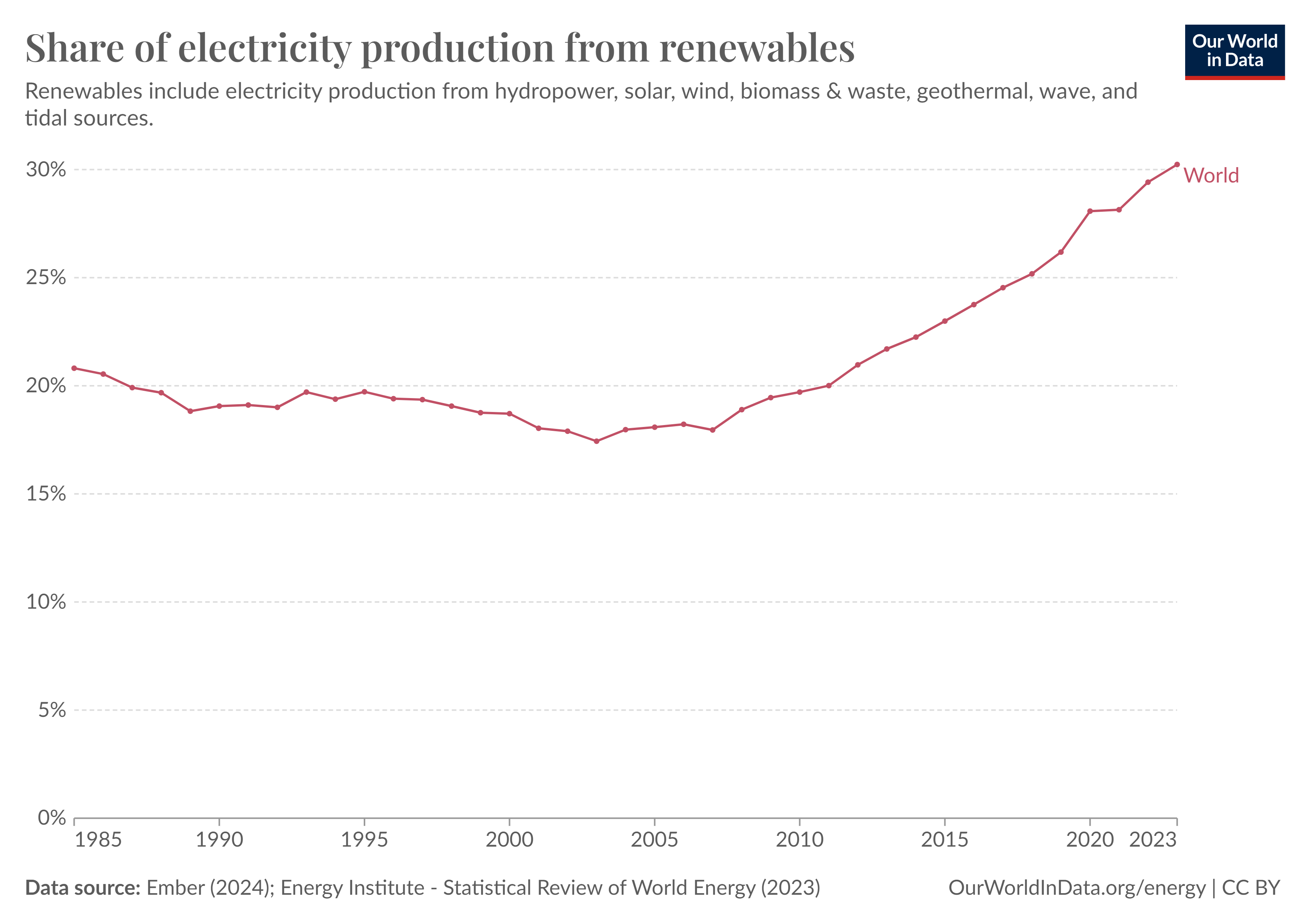
And so it would seem that 30% of the worlds electricity did indeed come from renewable sources in 2023. According to an article by Ritchie published today,
This growth was mostly driven by the rapid rollout of solar and wind technologies. Hydropower generation actually fell in 2023 as a result of severe droughts, especially in China.
But these claims are misleading. First, less than 20% of energy is consumed in the form of electricity. 30% of 20% is just 6%. The ‘transition’ to Net Zero requires the elimination of combustion, which drives most of the remaining 94%. When, for example wind power is seen in percentage terms as its contribution to world energy consumption, it barely registers at just 1.41% of energy consumed in 2022. Solar is even less productive at 0.88%. Hydropower, which like nuclear, has long been objected to by greens, has consistently provided between 2 and 3% of energy consumed since the 1960s.
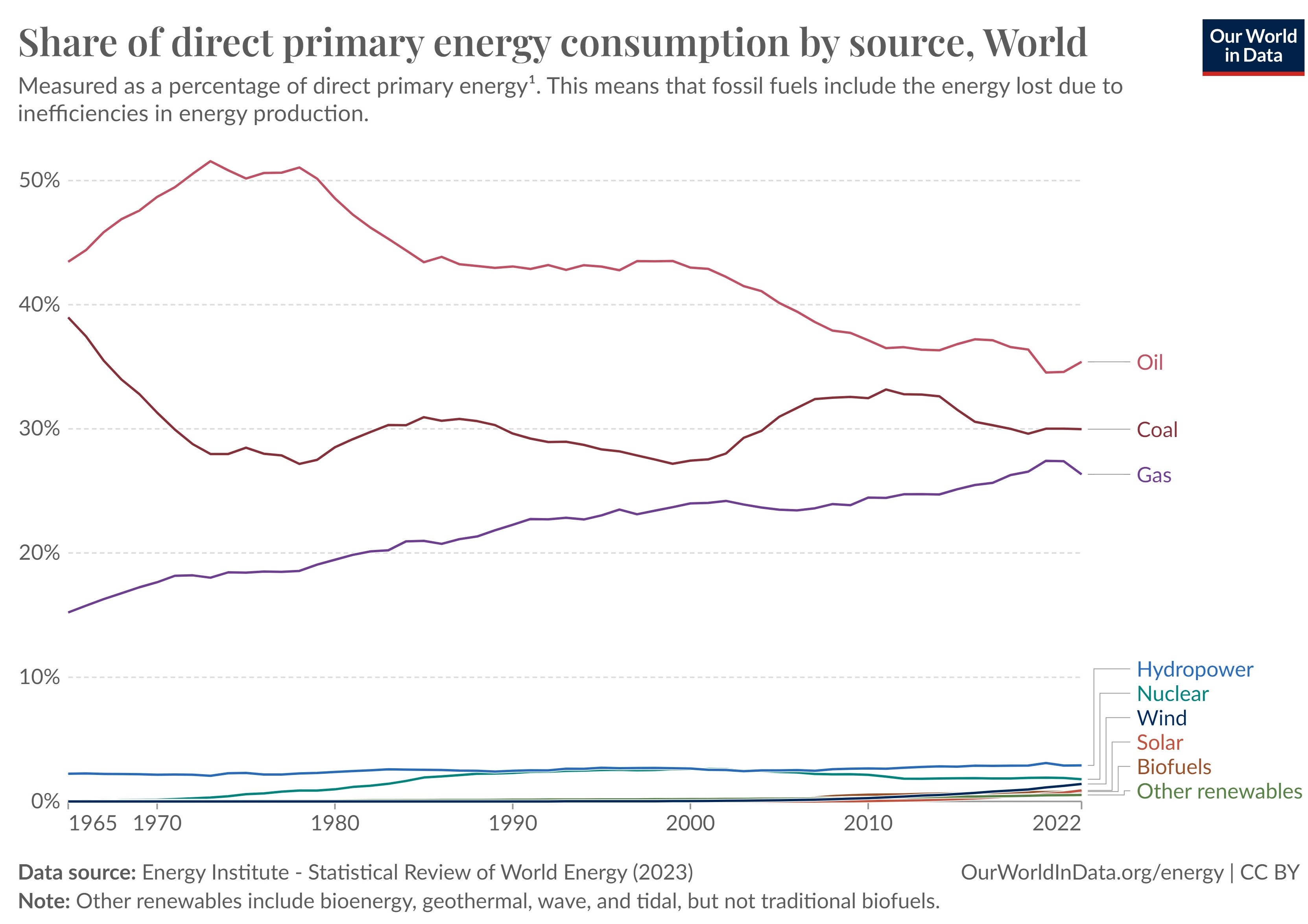
The preoccupation with electricity is therefore something of a distraction from understanding the scale of the job of ‘transition’. People use much more energy for heat and transport than can be achieved by using electricity. The ‘decarbonisation’ of the economy requires the electrification of applications dominated in the UK at least by gas and oil, and elsewhere by coal.
30% is therefore not quite the miraculous transformation it would seem. Coal, oil and gas remain by far the greatest sources of energy — each significantly bigger than the electricity market. To replace applications that run on coal, oil and gas with devices powered by electricity from renewable sources is going to be far harder than destroying coal-fired power stations and replacing them with wind turbines has been for a country like the the UK, which in any case has been deindustrialising.
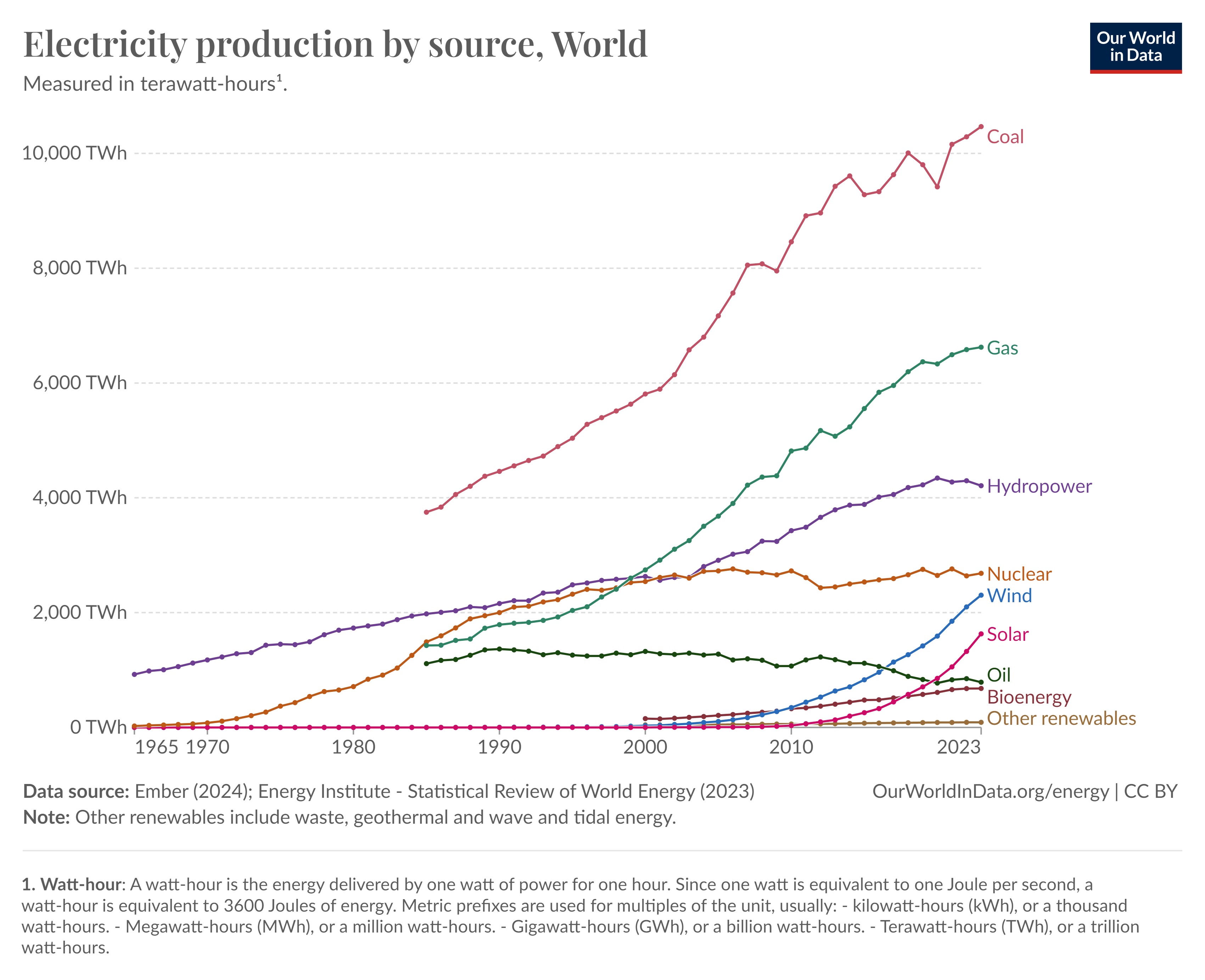
So has the 'rollout’ of wind and solar been rapid? I argue that Ritchie and the OWiD team are mistaken. The interannual variation of global consumption of coal, oil and gas is often greater than the entire production of either wind or solar, or both combined. Even when looking at just the electricity market, wind and solar look like fiddling around at the edges, rather than the emergence of a new infrastructure. They are no more rapid than were the expansion of coal and gas in the global electricity market as late at the 1990s — the era of climate policy-making — and yet create immense problems for grid management and costs for investors and consumers, as shall be discussed below.
Not all data that one might want in order to understand both sides of debates on energy and climate policy are available from OWiD. There are a lot of renewable energy propaganda pieces. Consider Max Roser’s piece, ‘Why did renewables become so cheap so fast?’, for instance, in which Roser merely reproduces data on the costs of renewable energy from Lazard and IRENA, which have been torn apart by Andrew Montford for the GWPF, for being based on flawed assumptions such as the ‘levelised cost of energy’, and which this Substack too, has pointed out, fly in the face of facts.
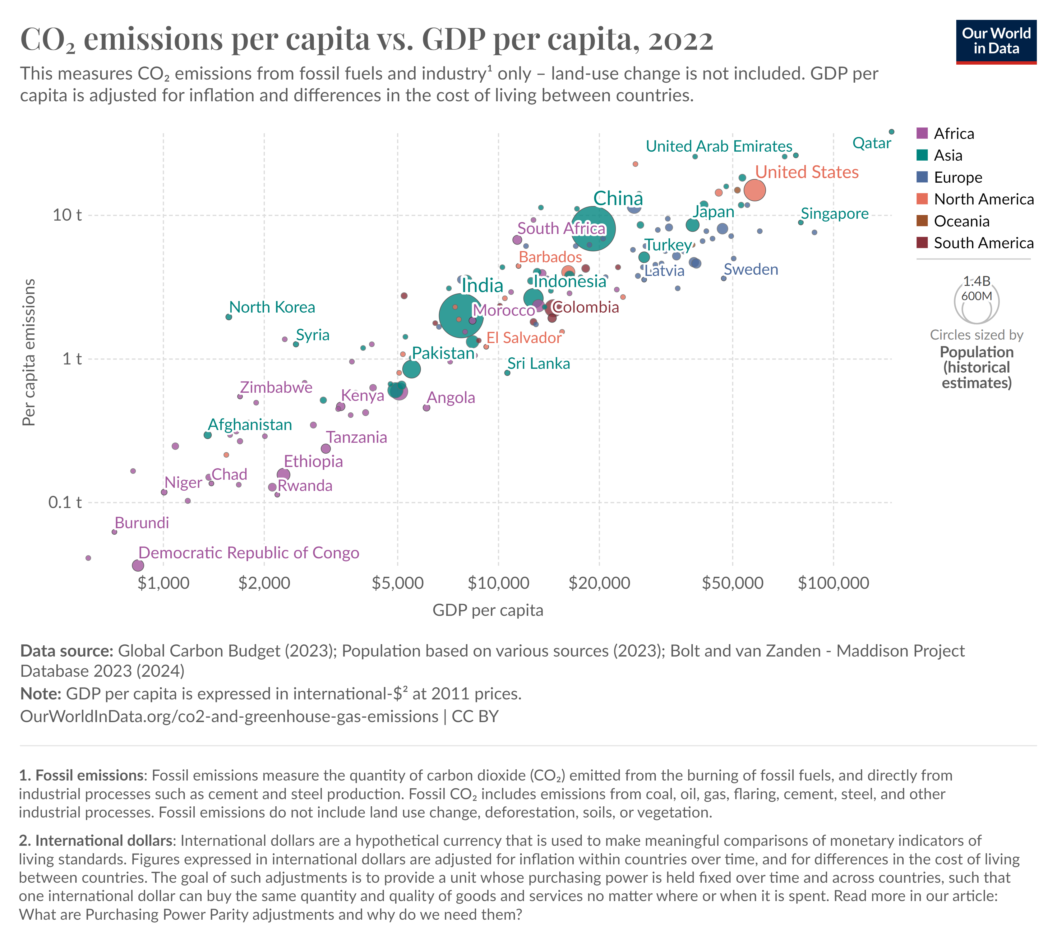
But the data is still useful. By obtaining from the UK government international comparisons of domestic energy prices (per kWh) and per-country data from OWiD on the ‘share of electricity production by source’, the following charts can be produced.
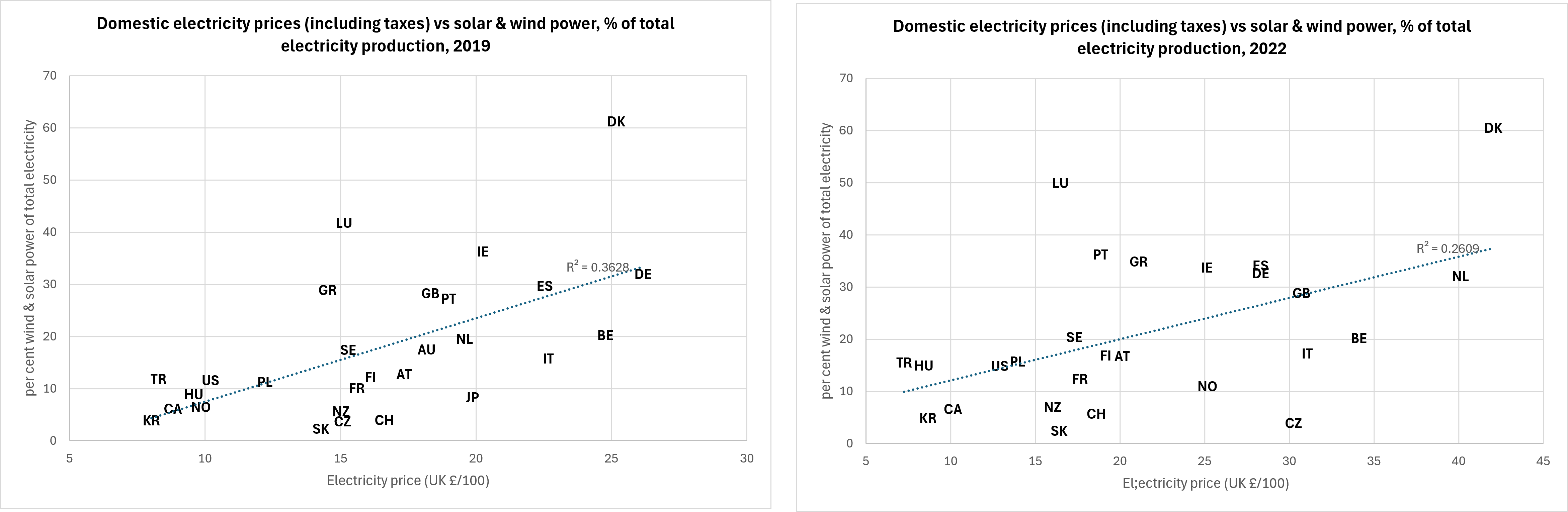
These charts show a strong relationship between the proportion of each country’s total energy supply from wind and solar and the price of domestic energy. Most of this strong relationship is through tax — i.e. subsidy for renewable energy generators. The chart on the left is from 2019 — which I believe is the more accurate reflection, being a pre-covid and pre-energy price crisis sample. The second is from 2022. OWiD do not publish data like this, and the reason for that omission seems fairly obvious. It is inconvenient.
And it is perhaps even more inconvenient than Ritchie’s observation that things on this planet are not getting worse. Because it shows that electricity is very far from being able to replace fossil fuel combustion without reversing the progress that Ritchie herself has witnessed. Note that the following chart has a logarithmic axis.

The relationship between CO2 emissions and human welfare really isn’t an accident.
You might think that, having observed the effect of such a relationship, one might have paused and thought, ‘maybe those deniers had a point’.
But instead, OWiD positions itself in the green camp, and for the most part, funnels its users towards an ideological, not data-driven understanding of climate and socoety’s relationship with it. And then its staff produce such crass broadsides against ‘deniers’ — people who might want to point out that the fundamental relationship between wellbeing and CO2 emissions is one worth understanding before it is radically altered.
The most egregious data-manipulating caused by green ideology comes in OWiD’s Energy Data Explorer, and other data relating to the productivity of renewables. Consider this chart. It shows that 3.27% of primary energy consumption was supplied by wind power in 2022. (The data does not extend to 2023.)
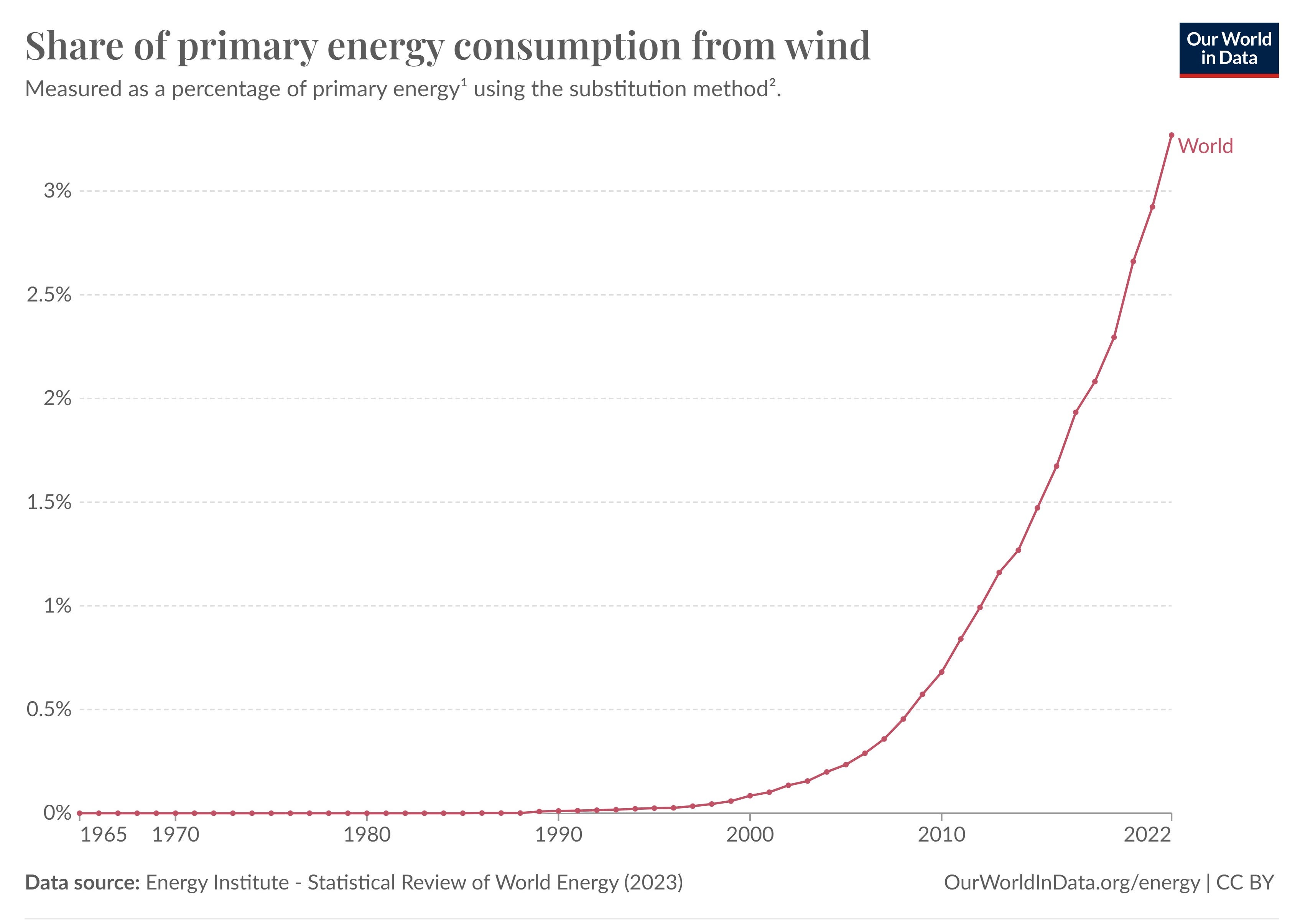
Wind power contributes more than 3% to primary energy consumption? Wow!
But didn’t we read above in a chart that showed wind power’s share of direct primary energy consumption at just 1.41%?
The difference between the two figures — 3.27 vs 1.41% — is the result of applying the ‘substitution method’ of energy accounting to the real data. The rationale of this data massaging is that, since generating electricity from combustion is inefficient — not all of the heat is converted into power — and whereas renewable sources such as wind power are 100% efficient, some compensating factor must be applied to give us a better picture. OWiD explain,
To ‘correct’ for these different methods of accounting, researchers can apply the ‘substitution method’. This tries to adjust non-fossil energy sources to the inputs that would be needed if it was generated from fossil fuels. It assumes that wind and solar electricity is as inefficient as coal or gas.
Here’s the result of the adjustment.
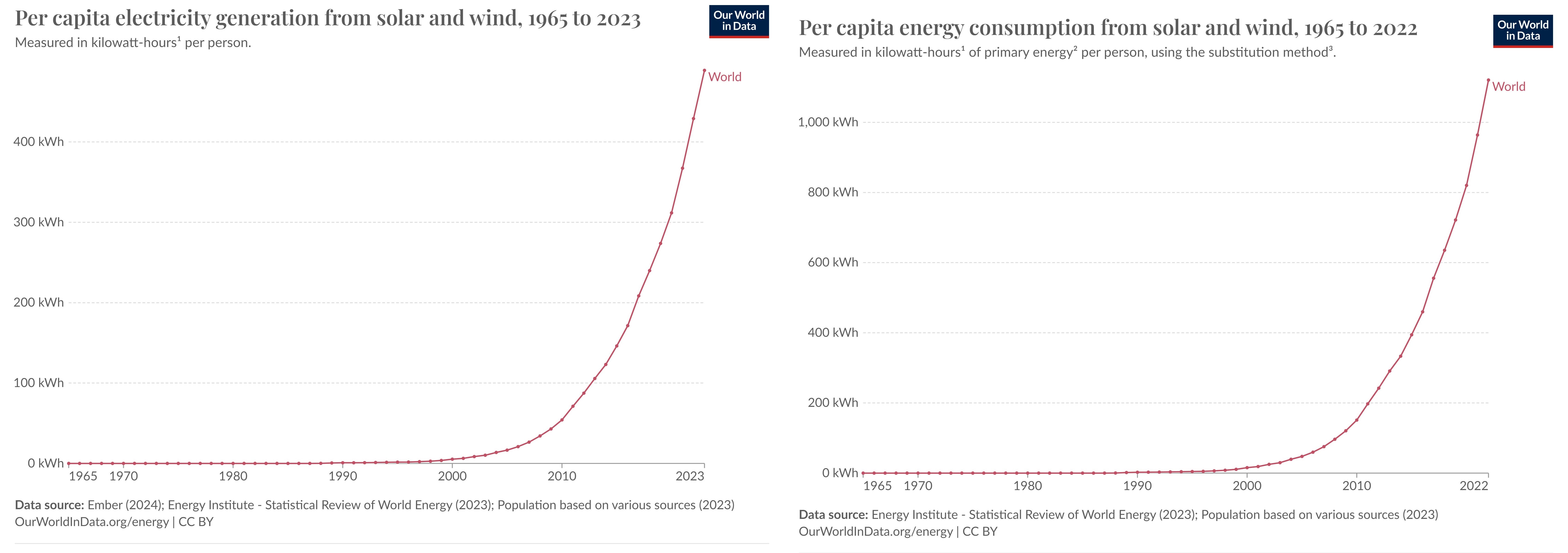
A helpful explainer adds more information:
The ‘substitution method’ is used by researchers to correct primary energy consumption for efficiency losses experienced by fossil fuels. It tries to adjust non-fossil energy sources to the inputs that would be needed if it was generated from fossil fuels. It assumes that wind and solar electricity is as inefficient as coal or gas.
To do this, energy generation from non-fossil sources are divided by a standard ‘thermal efficiency factor’ – typically around 0.4
Nuclear power is also adjusted despite it also experiencing thermal losses in a power plant. Since it’s reported in terms of electricity output, we need to do this adjustment to calculate its equivalent input value.
What does it mean to ‘divide by a standard thermal efficiency factor’?
Most people would understand that an arithmetical operator like division makes a number smaller. But a division by a number smaller than 1 is a multiplication. 1 divided by 0.4 = 2.5.
So why not just say that the adjustment multiplies the renewable energy data by 2.5 times?
Because, by most people’s standards, adjusting data by a whopping 250% is manifestly data manipulation. But now, members of the public and journalists, and politicians seeking to inform themselves using the data provided to them by an organisation cloaked in the authority of the University of Oxford have been impressed by green energy’s remarkable progress — nearly three times more than those deniers were claiming the other day, right?
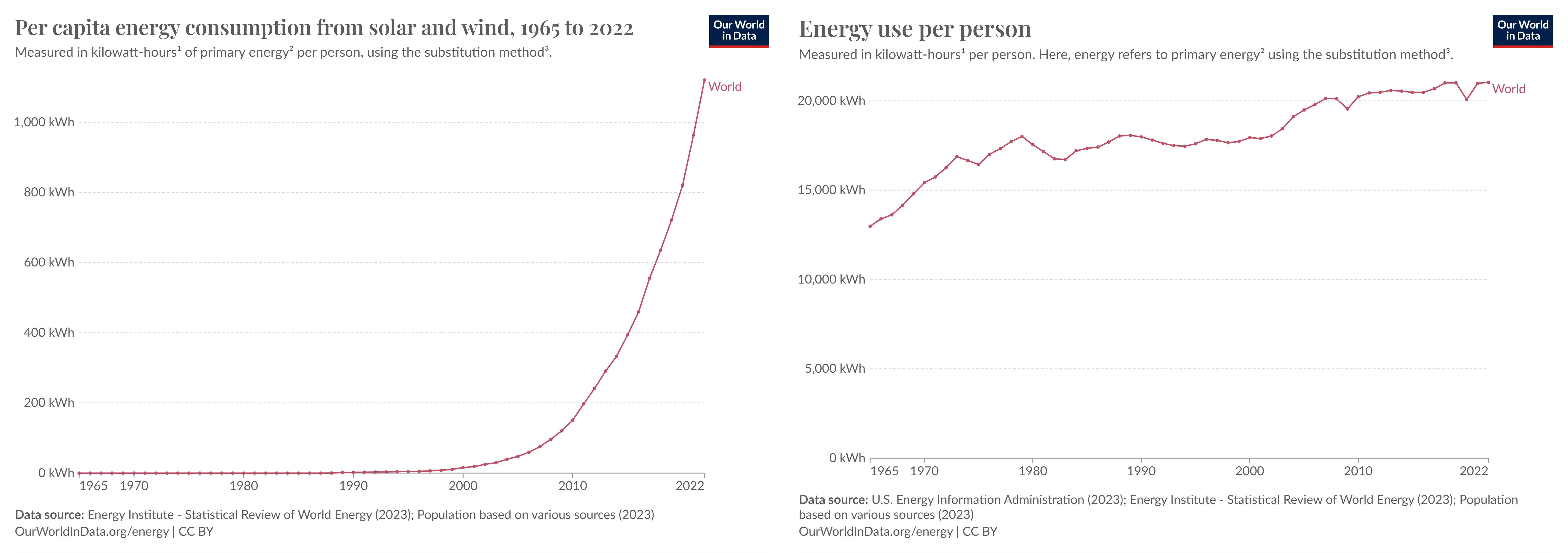
Worse still, the data is further contaminated by this ‘substitution method’ being variable over time.

‘Denial’, then, means being concerned with the accuracy of data and its overt manipulation for political ends, whether that political ambition causes the author of the data to make a decision to put their thumb on the scale, or insidious ideology moves it without their notice. And ‘deniers’ are the people who think that policies should not be based on data which is multiplied far beyond what is reasonable, by tricksy ‘substitution methods’ or opaque metrics like ‘levelised cost of energy’. ‘Denying’ is the rejection of the false picture of the world created by ideology and ideologues acting under its influence as it flatters them into believing that they are ‘making the world a better place’, despite profound evidence to the contrary. The world is probably doing just fine without their beneficence.
The whole industry is maintained on lies and data manipulation mostly by grifters. They will keep lying and manipulating until the grid crashes and they'll lie again laying blame at the door of Fossil Fuels. Eventually they will slowly stop talking about it as they have no place to go, and we will be left with the bill for clearing up. But it will be decades.
First it was global cooling, then it was global warming, then it was climate change and now it's extreme weather. This shifting of the (official) 'target' is instructive for the future. We can expect a whole lot more of this as reality slams into the face of the Catastrophisers.
Nice work Ben. I haven’t actually finished your piece as i distracted myself with your assertion that risk and death and frequency is all you need to know. I would think that intensity is also a player in the risk/death equation. Example, 20 landfalls all at hurricane level 5 versus 20 at level 1. Or 20 wildfires at 100 km2 versus 20 at 1000 km2. I am no expert but it seems logical that the overall risk is affected by its occurrence and its intensity. Am i missing something?